Paid subsription
5 million +
iOS, Android, macOS, CarPlay
4,5
New tourist routes feature and cards redesign:
↑ 30% in paid subscriptions, ↑ 18% in monthly audience
project setup
As a founding designer I performed the roles of product manager, designer, researcher and analyst
👨🏻💼
CEO
🦸🏻♀️
Me
🧑🏼💻
👨🏻💻
Developers
👩🏼💻
QA
The Task
We planned to add an information about hiking trails
The goal of Guru Maps is to become the number one travel app.
One of the strategy points necessary to achieve this goal is to add information such as statistics, graphs and other useful data about hiking trails.
According to our roadmap, we planned to launch this feature before summer to capture the most popular season.
Analyzing the task
Find similar elements in the app
A peek into analytics
I looked at the analytics and found out that the recorded tracks screen is one of the most used screens in the app.

Problem Identification
I conducted user research to understand:
How users currently cope with the lack of hiking routes on the map.
What are the problems with the current recorded tracks screen.
We don't have a researcher, so I took on this role myself. I found respondents, composed questions, organized and conducted 10 interviews, processed the results.

Main insight: People switching to other apps to get missing data
✦ Lacks visualization of statistical data
It is not enough for users to see only a numerical data, for some data a visual display is necessary.
✦ Lack of diversity in statistical data
Various user scenarios imply that users expect to see statistics, depending on their activity.
✦ There are not enough tools for editing tracks
People need more flexibility to edit tracks to get the most accurate results.
Seeking Solutions
Kill two birds with one stone
After discussing the results with the team, we decided not just to add new screens, but to rethink some old ones that are close in content to the new ones.
This way we can:
Optimize development by rewriting the code into unified components.
Refresh the application design, since the affected screens make up 90% of the application screens.

Finding out what is the most important for users
The most used screen in the app was overloaded with data. I decided to conduct another research study, this time a quantitative one.
We created a simple Google form and asked our users to indicate which statistics were most important to them. The responses gave me a clearer understanding of how to best organize the data.

Design process
I started making concepts to see which ones:
Would work best with a lot of data.
Which structure would fit best on such a variety of source screens.

While discussing concepts with the team, we defined the requirements for these screens:
✦ Easier to develop
There should be maximum native iOS elements for easy support and porting to other platforms.
✦ Launch as soon as possible
Not to miss out on the hottest season for travel apps, we had to launch in time for the summer.
✦ Adding graphs
An important and expected feature that will help keep users in our app.
✦ Only useful data on a screen
As the study showed, it is important for users to quickly view statistics and compare them.
I focused on these points and started working through the elements
The time frame and constraints of development imposed their own limitations, so I proceeded without delay to design the elements of the card. It was important to think about each element so that it would work equally well with large and small amounts of data, as well as be reusable on other screens.
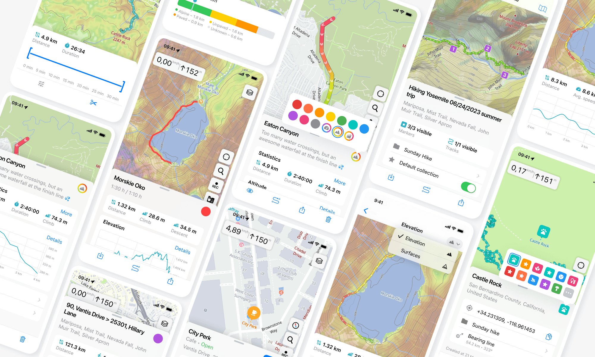
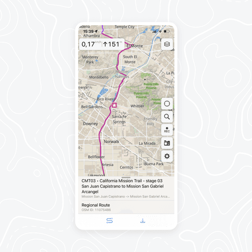
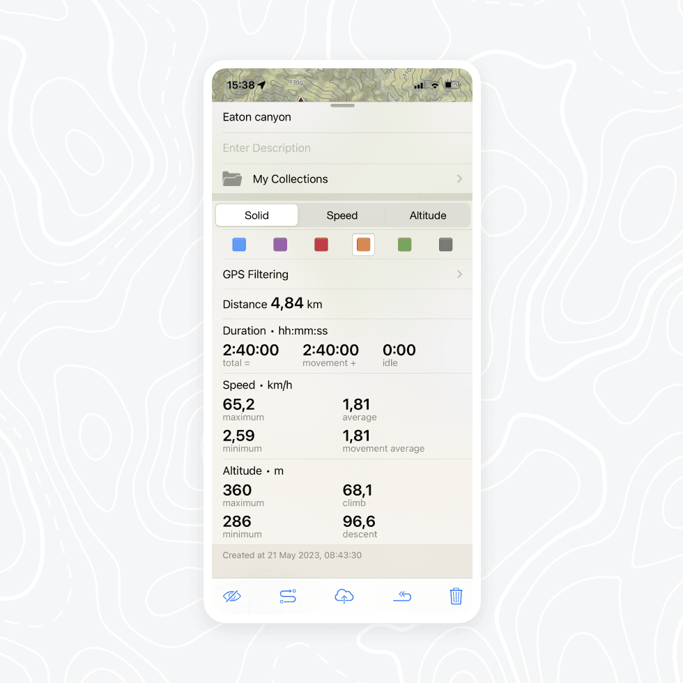
Flexible and diverse statistics
For statistics we chose a variant that is optimal in size and can be adapted for different number of blocks.
The statistics block can change depending on the content.
I added icons for quick scanning of information.


The visual display of data that everyone has been waiting for
For faster development and easier support, we decided to use a native ios framework for charts. It suited our tasks perfectly.
Simple and intuitive editing
There is a quick way to edit a track or marker — change its color or icon. We also added more colors so that users have more variety and options to customize their collections.

As a result, it came in a simple block structure
Block structure allows us to add and exclude blocks or rearrange them, depending on content and screen type.


Beta Testing
We conducted real-world testing, to ensure the new version performs well in various conditions
After addressing some bugs, we finally released the TestFlight beta version to our users 🎉
We have received numerous positive comments from users, along with some valuable bug reports.

Results
After improvements, we released the new version for all users
30 %
Increase in app purchases
18 %
Monthly audience increased
5↗4
Rating of Top Grossing Apps
The response has been overwhelmingly positive: we have received a huge amount of admiring feedback


~90 %
Of app’s screen were updated
✦ Expanded coverage of user scenarios
✦ Consistency in design and improved UX
✦ Faster development by using unified components
Learnings and challenges
Multitasking
The lack of a manager, researcher, and analyst required me to take on these roles myself
Development limits
Resulted in not all planned features being implemented, but they were kept for future
Tight timelines
It was crucial to release as soon as possible to capitalize on the summer season
Dive into analytics
I immersed myself in the world of business analytics and data analysis
Hands-on testing is fun
I took part in hands-on testing, which turned out to be a rewarding experience
More tests for future
Due to time constraints we only did a beta test, but I would do an A/B tests in the future
This project taught me how to implement significant changes in a cost-effective manner